
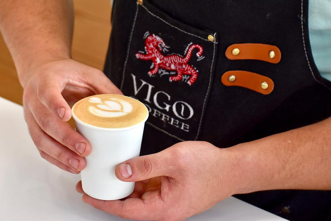
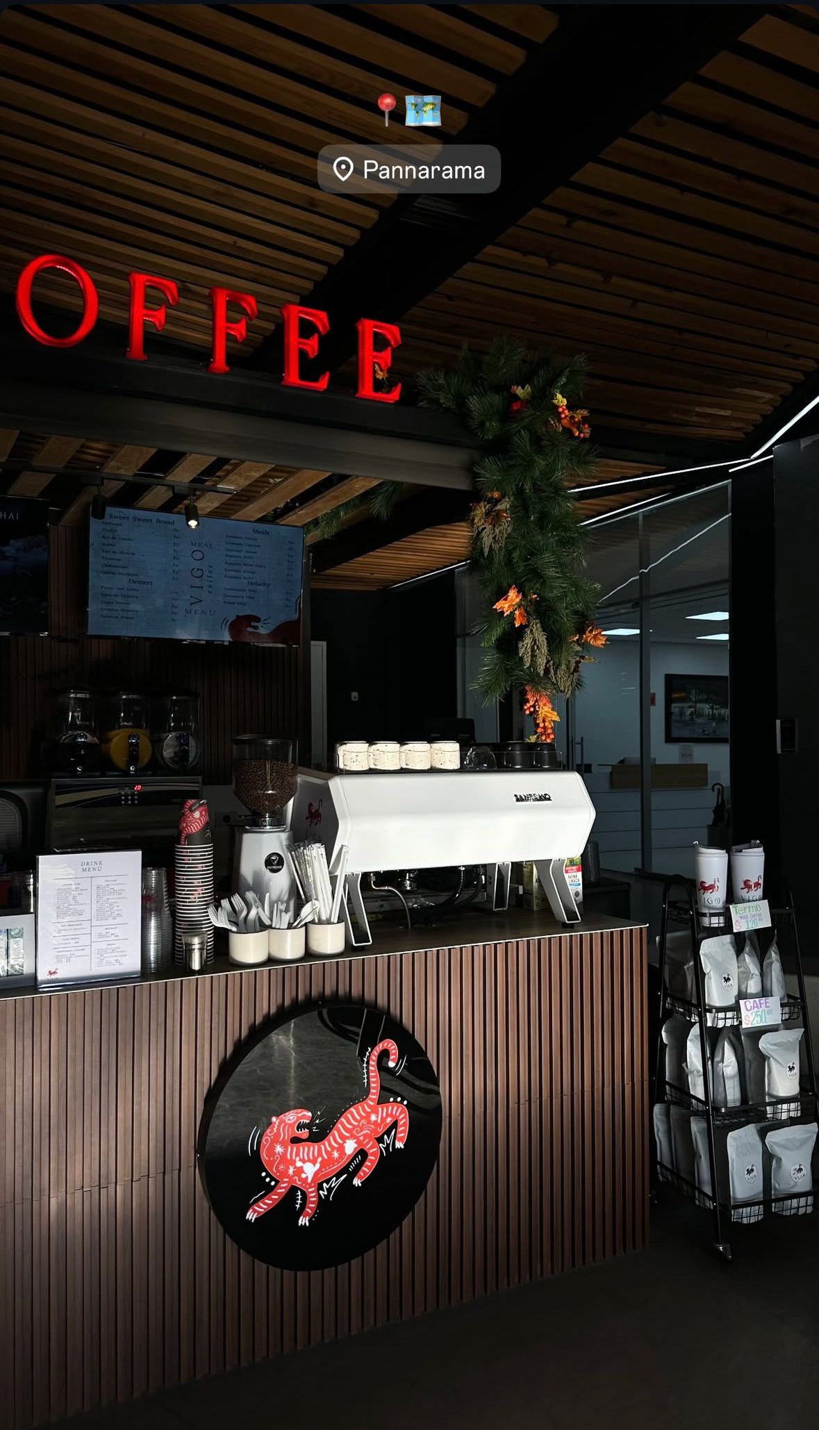
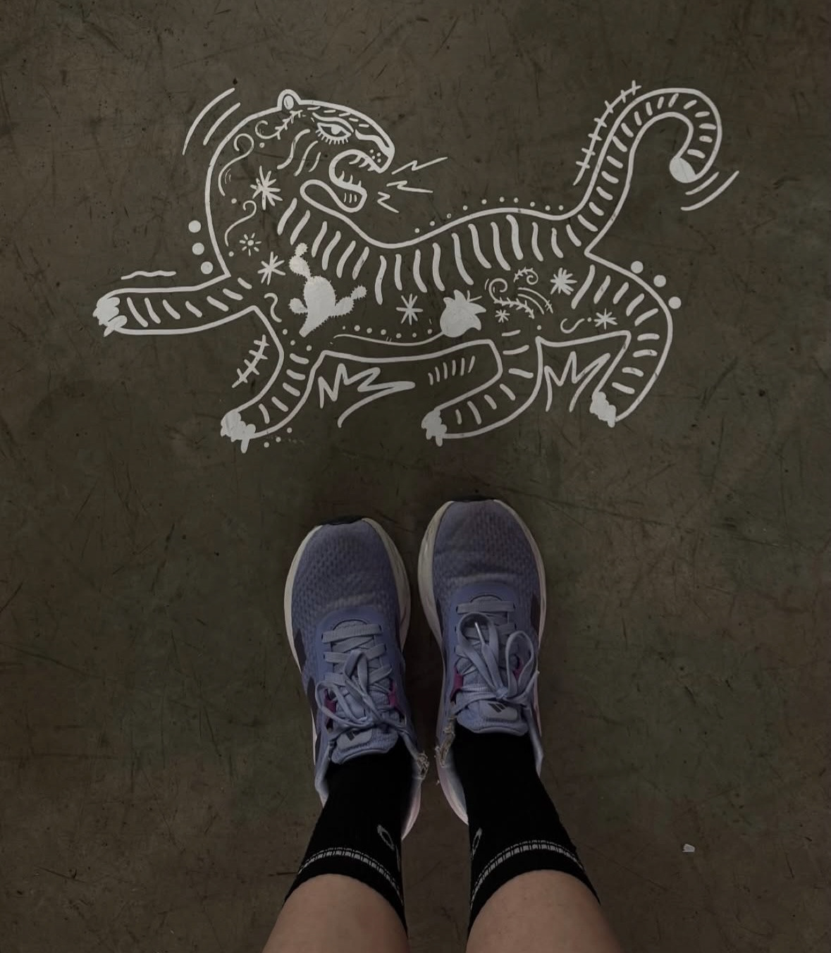
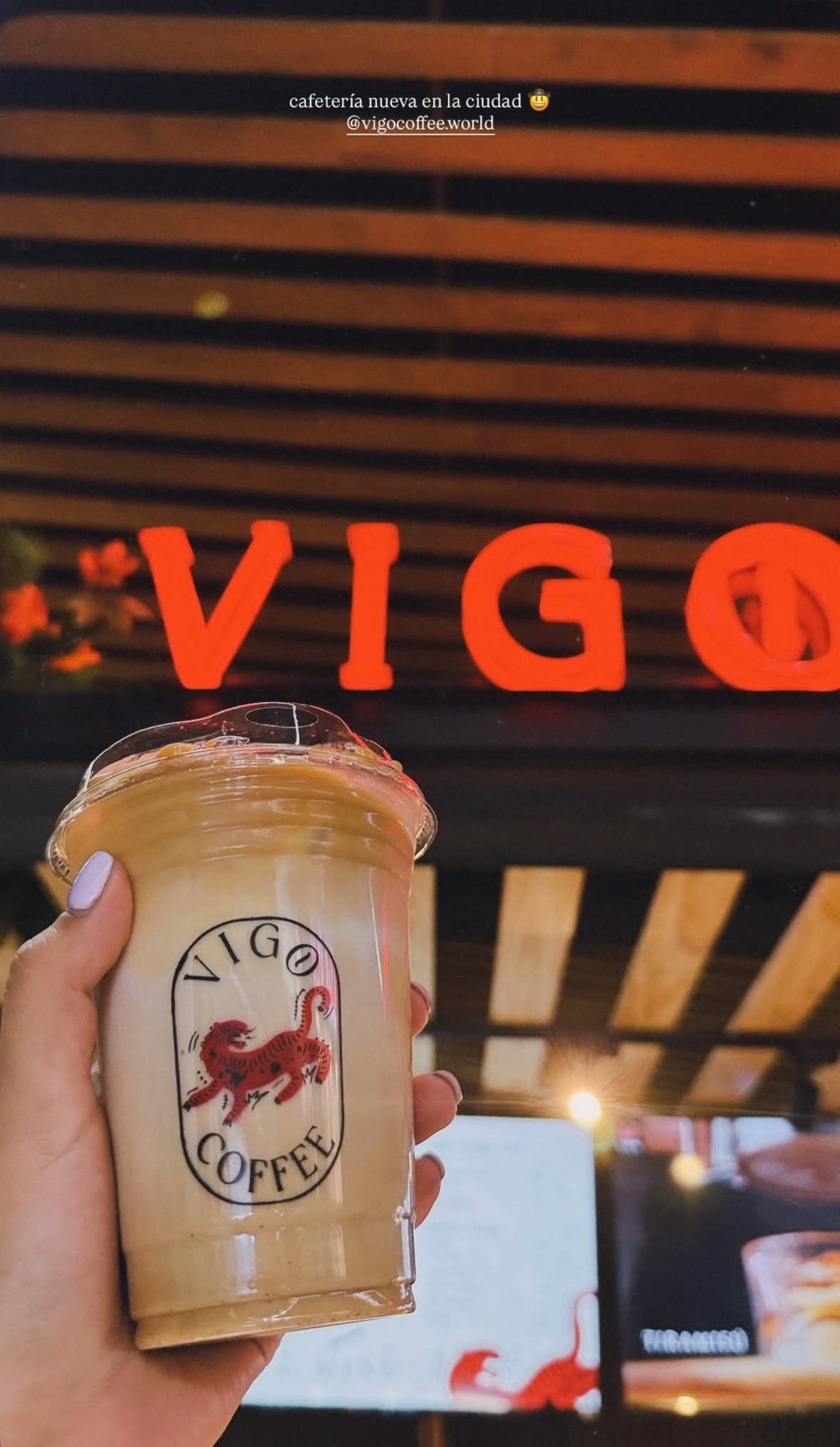
I recently Corporate coffee brands are built on rigid grids, but Vigo required a human touch. For this international roaster operating across Mexico and the USA, I rejected the clean sterility of digital design in favor of something raw and artisanal. I approached the logo not as a vector symbol but as a piece of illustration, blurring the line between art and branding. This aesthetic grounds the brand in its roots, proving that true quality doesn't come from perfect geometry, but from the warmth of the human hand.


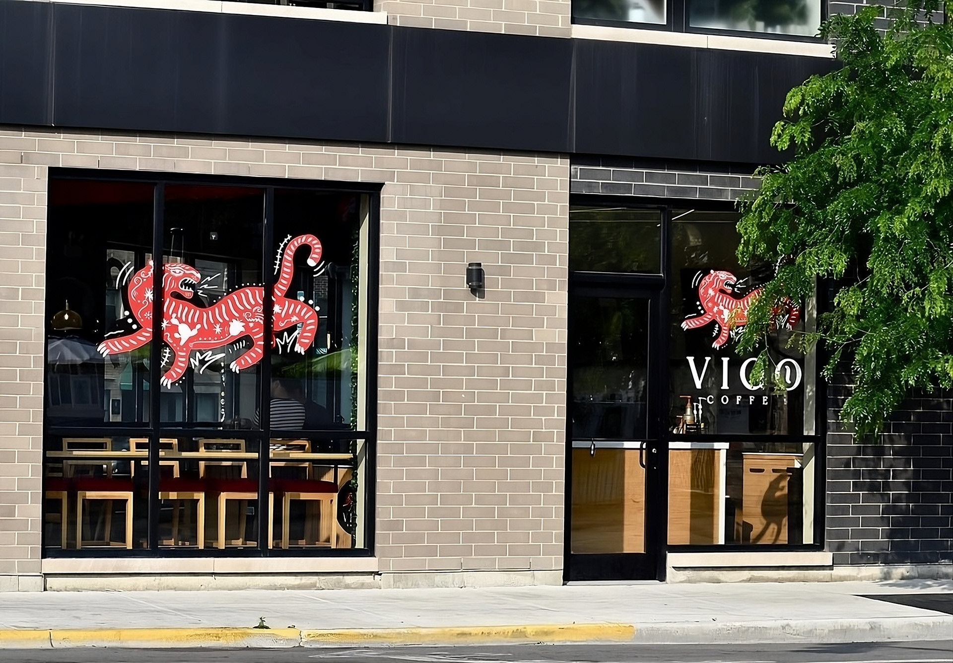

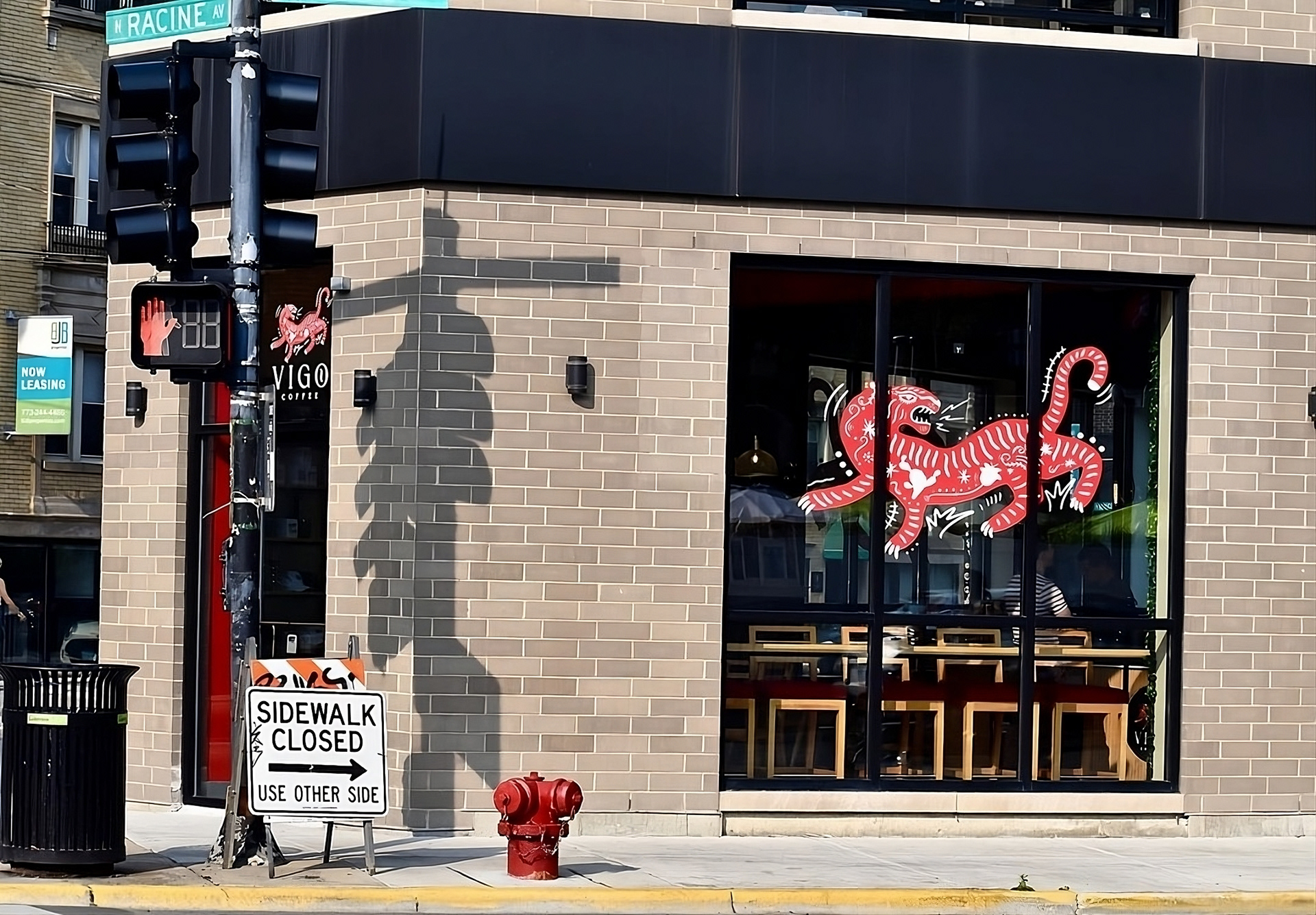
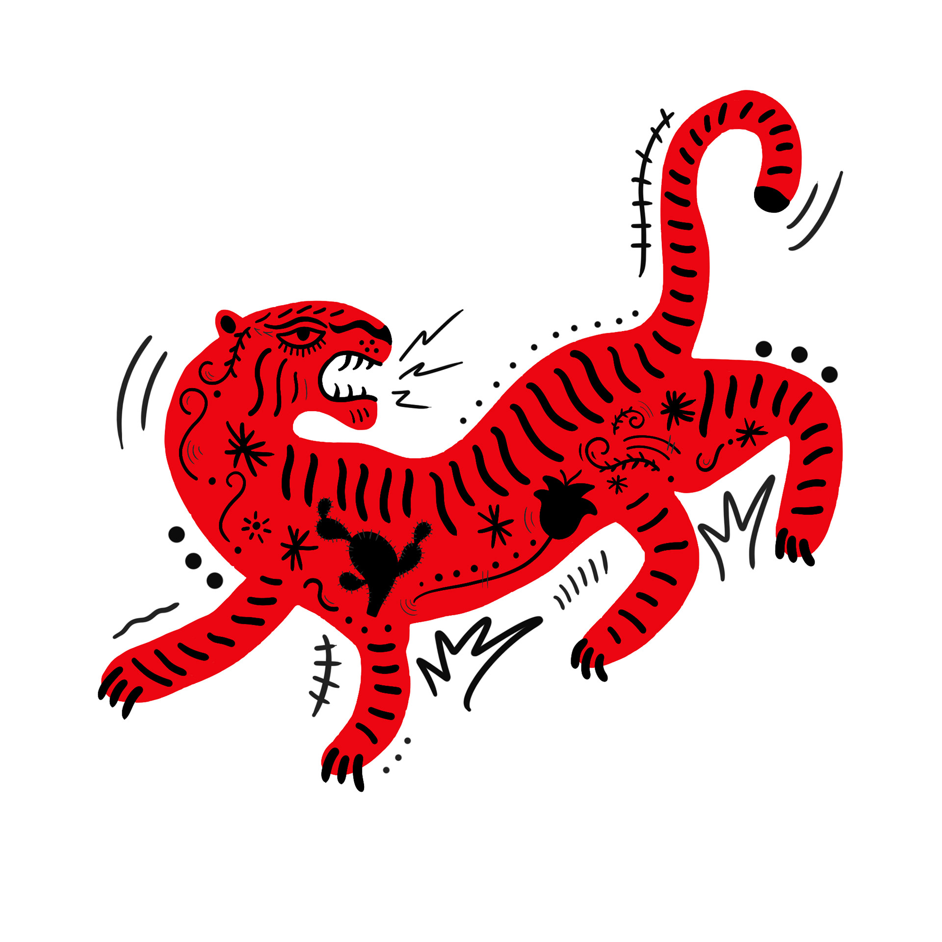
Brand: Vigo Coffee
Role: Art Direction & Brand Identity
Role: Art Direction & Brand Identity